IMA already created social content for Rubicon drinks brand. I was tasked with looking at how we could make improvements to the brands social feed designs.
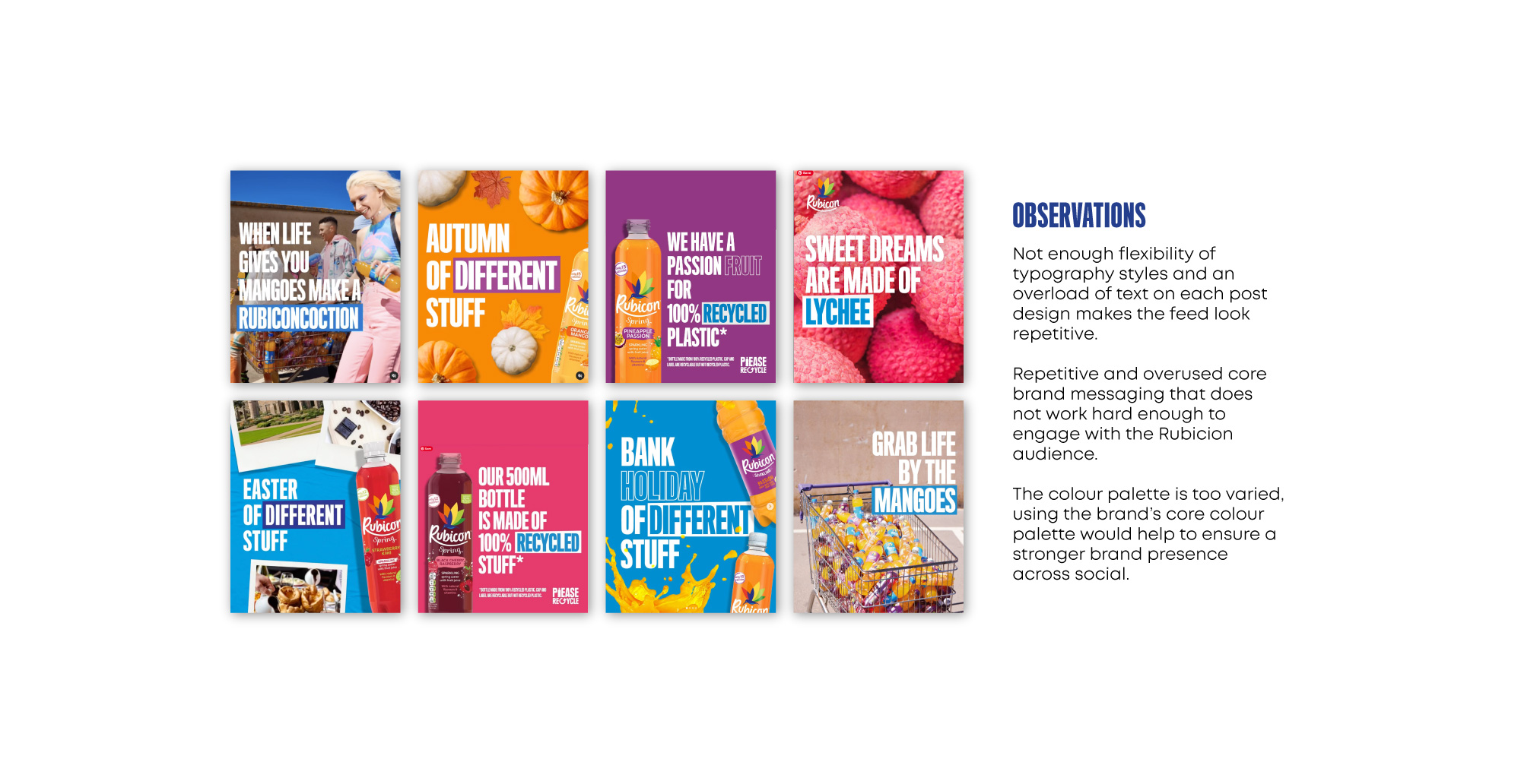
I identified the problems in design as repetitive typography styles, an overload of information on posts, not enough brand presence in the colour palette and static looking designs.
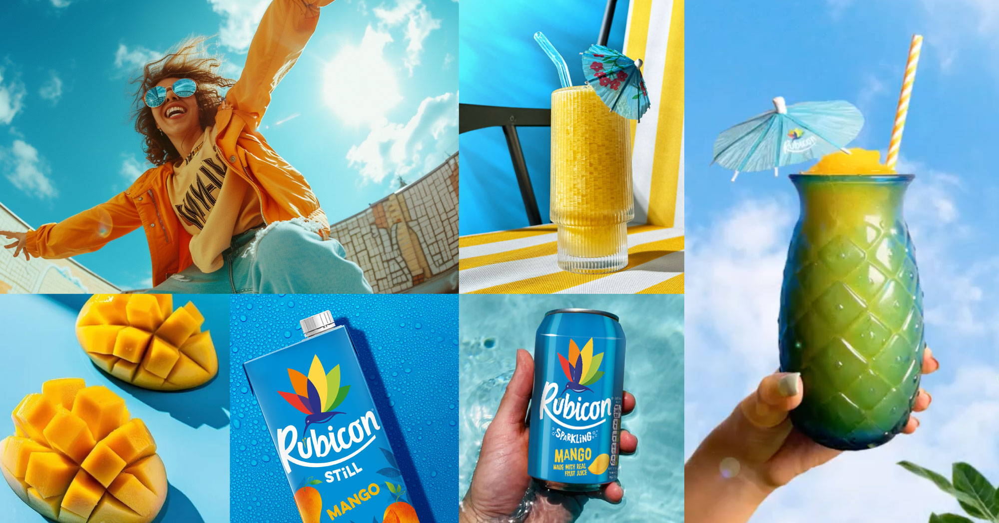
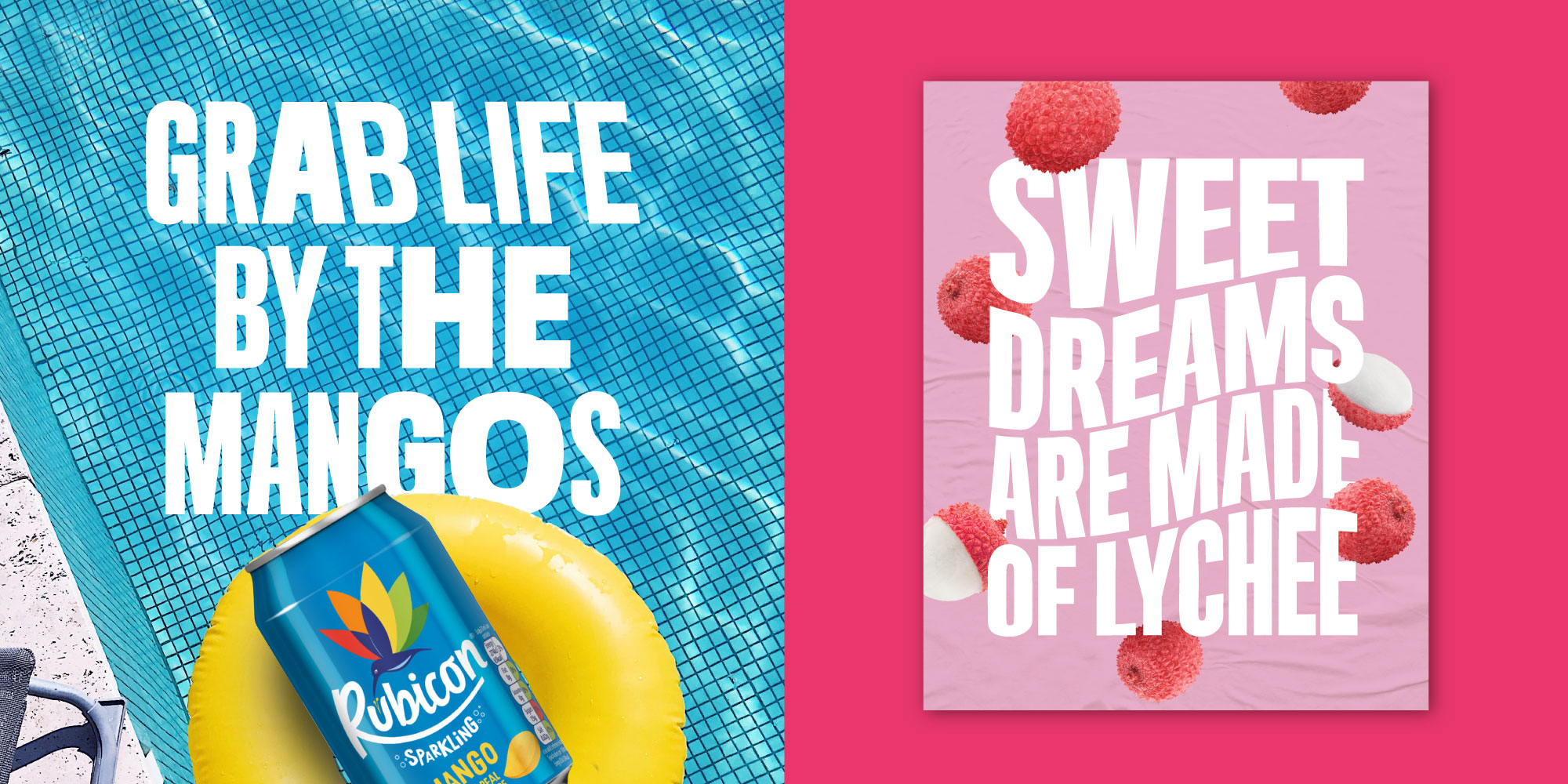
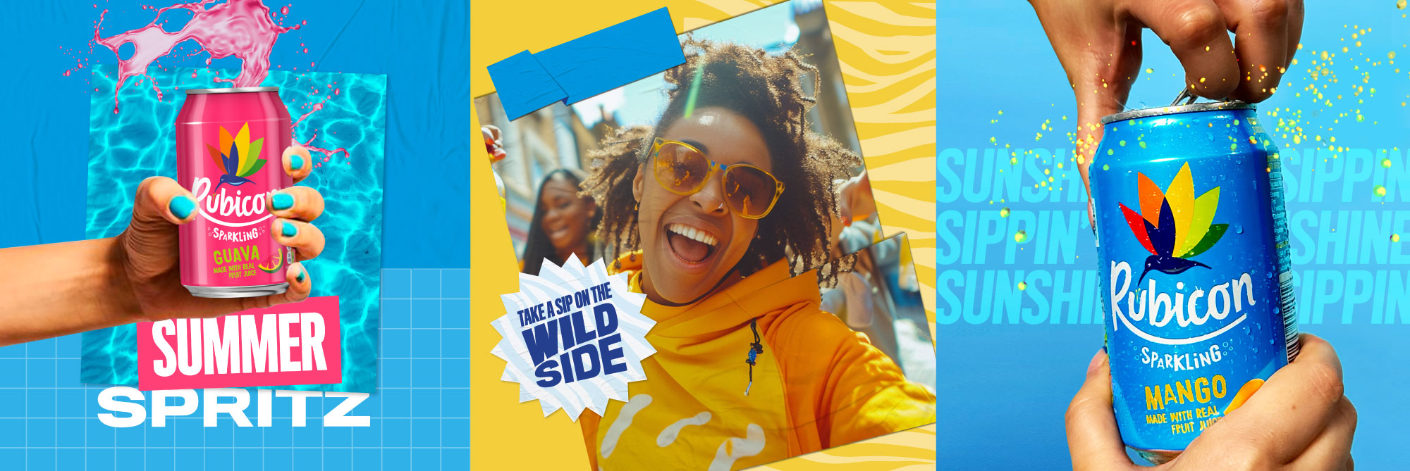
The brands original flavour is mango and the core colour palette is taken from it’s packaging, with blue being the primary brand colour. This should be represented more throughout the feed using more blue as graphic backgrounds but also tonally within photography. Rubicon drinks are tropical flavours so bringing the sunshine and holiday feeling into photography over summer months is key. The other colours in the brand palette should be reserved for flavour specific posts.
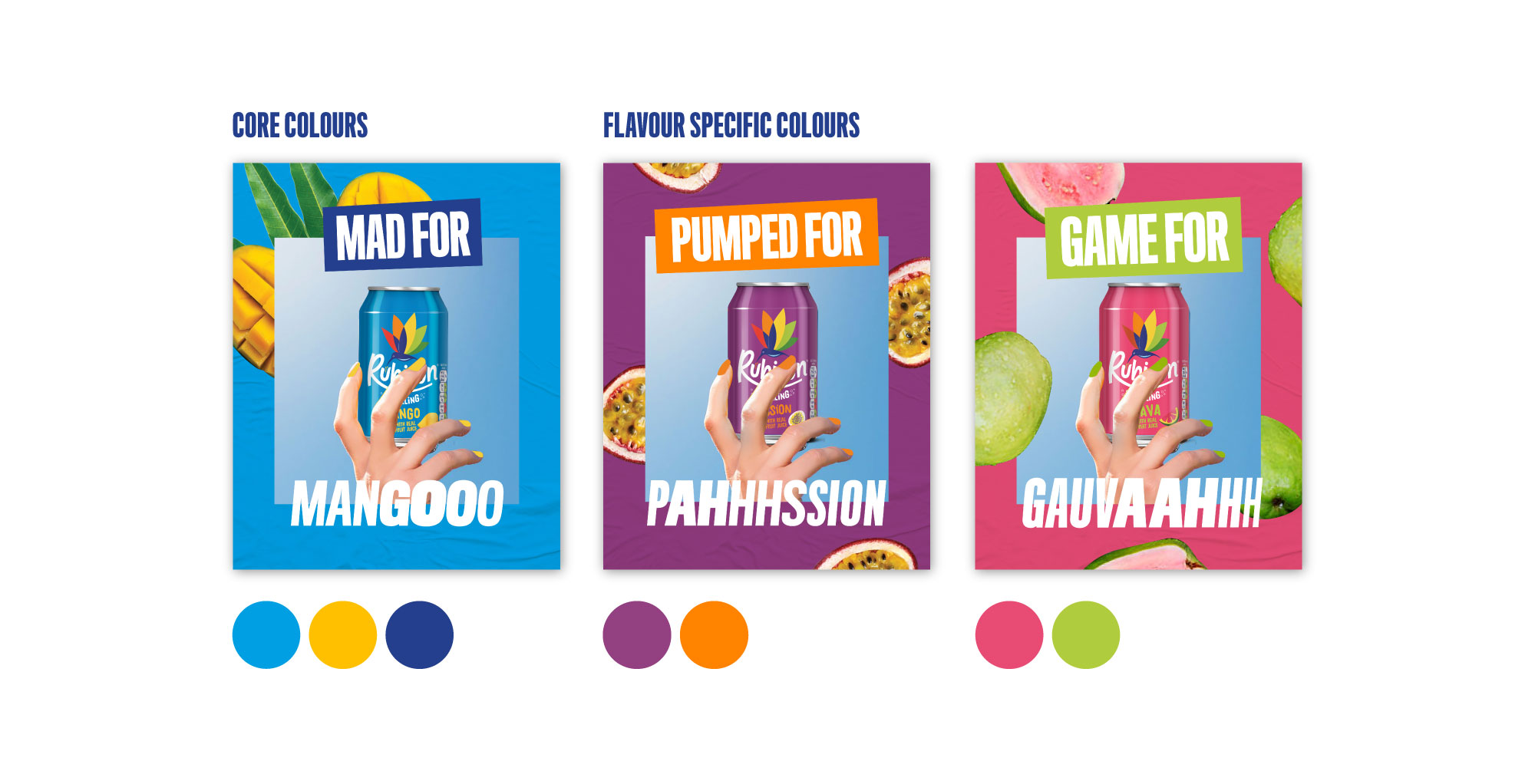
Titling gothic is the font used for the brands strapline, OOH campaigns as well as the social designs and we need to continue using it for brand consistency. However we can experiment with typography styles using our fonts different weights within words to add variation and to express the fun side of the brand.
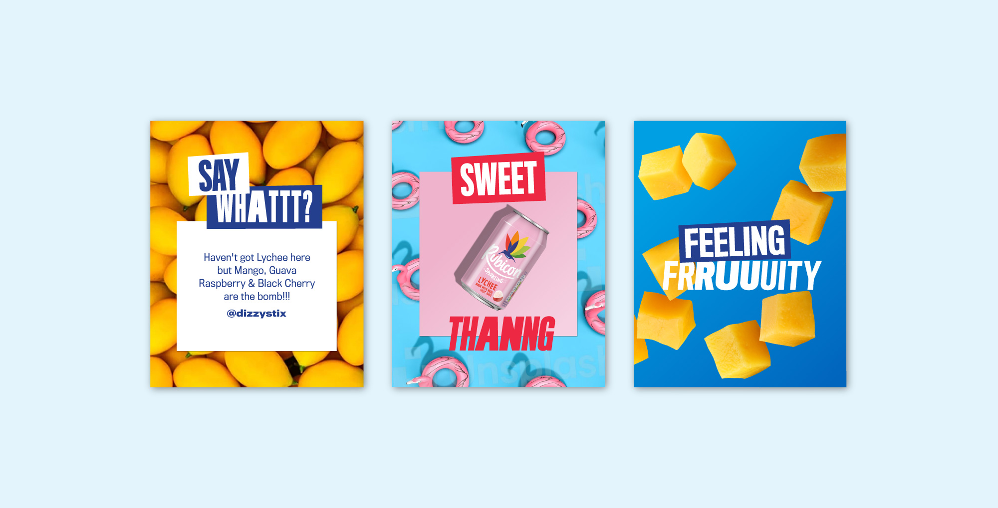
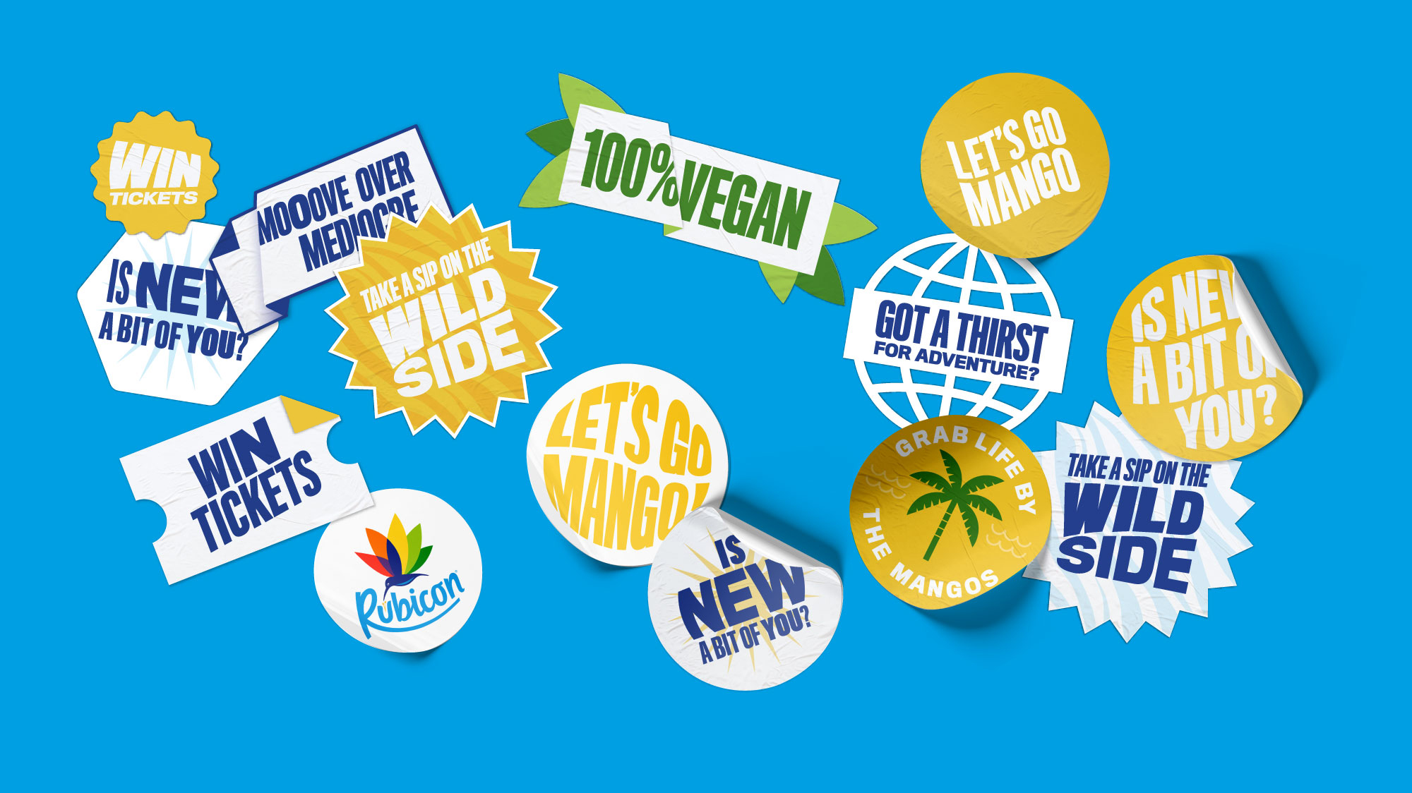
We can resonate with Rubicon’s younger audience by adding in letters to spell words phonetically, so when you read it you can’t help but hear it adding more fun to typography. Stickers graphics can become another design tool to add shorthand key messaging to social feeds without creating repetition of larger headlines.
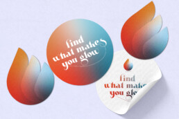
And finally we can add depth and interest by creating layered posts to capture attention and create a flexible and varied yet cohesive design system.
ClientRubiconWhilst atIMAServicesSocial Media Design Direction