Boreland is an idyllic holiday retreat on the edge of Loch Tay. Their remote location in the Scottish highlands offers fire pits, hot tubs and adventure activities perfect for stag and hen do’s.
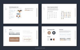
The brand concept for Boreland uses flag symbols inspired buy the semaphore alphabet. This was used to create their logo and the shapes were used throughout the rest of the branding.
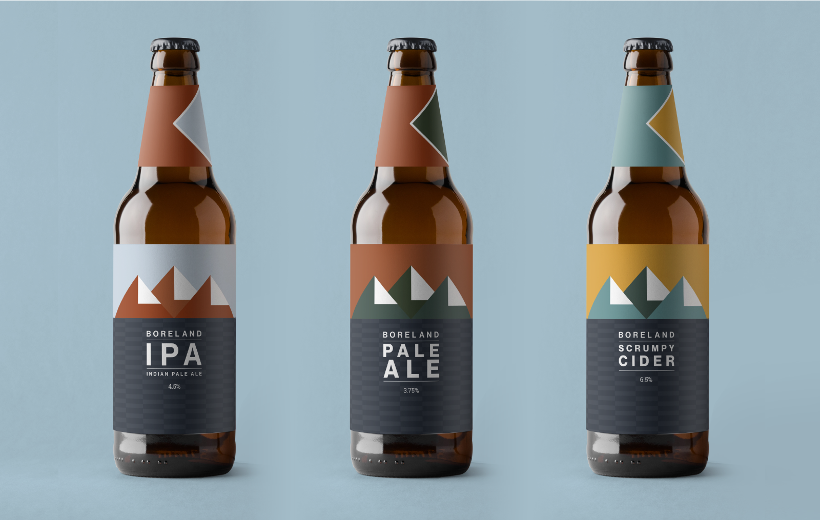
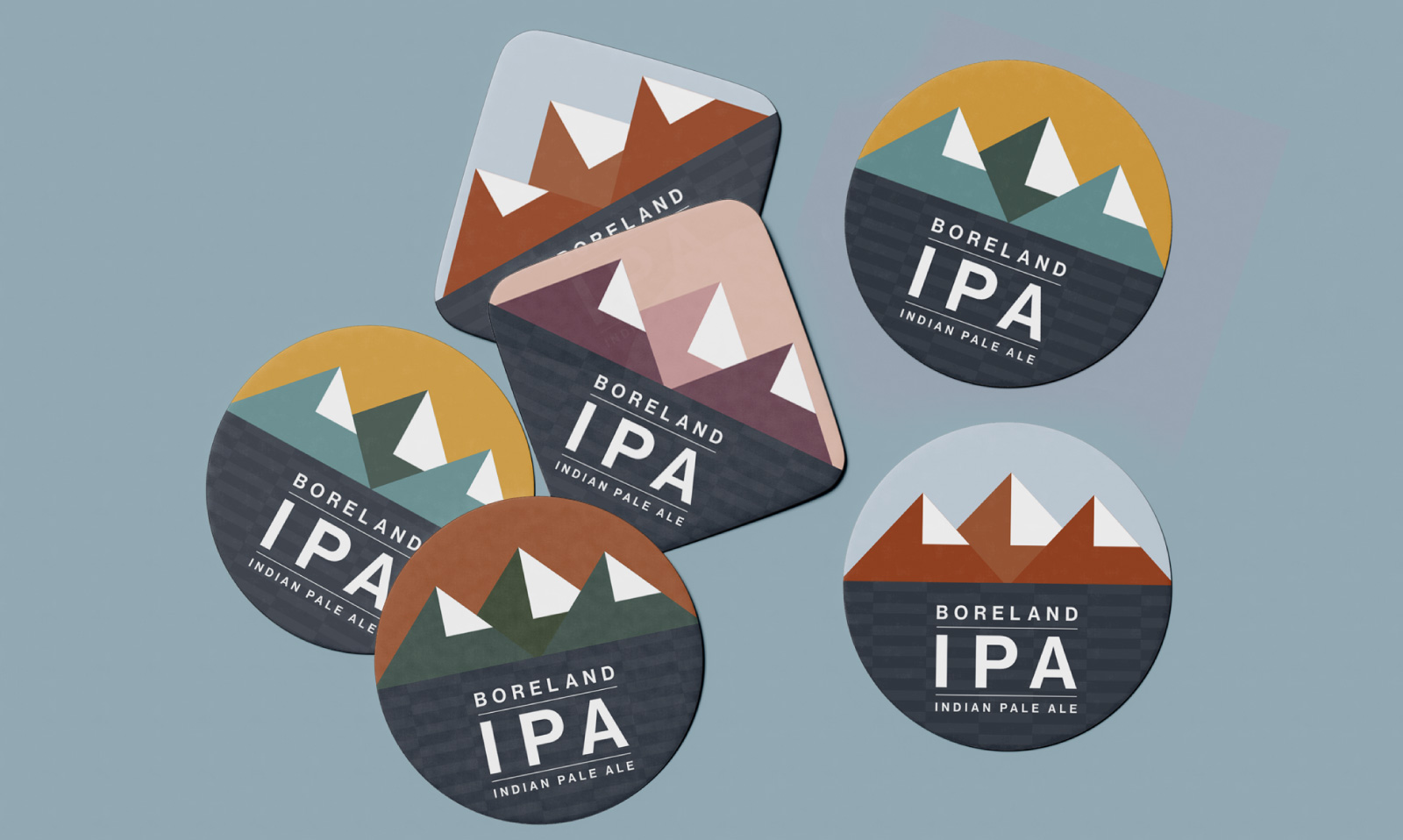
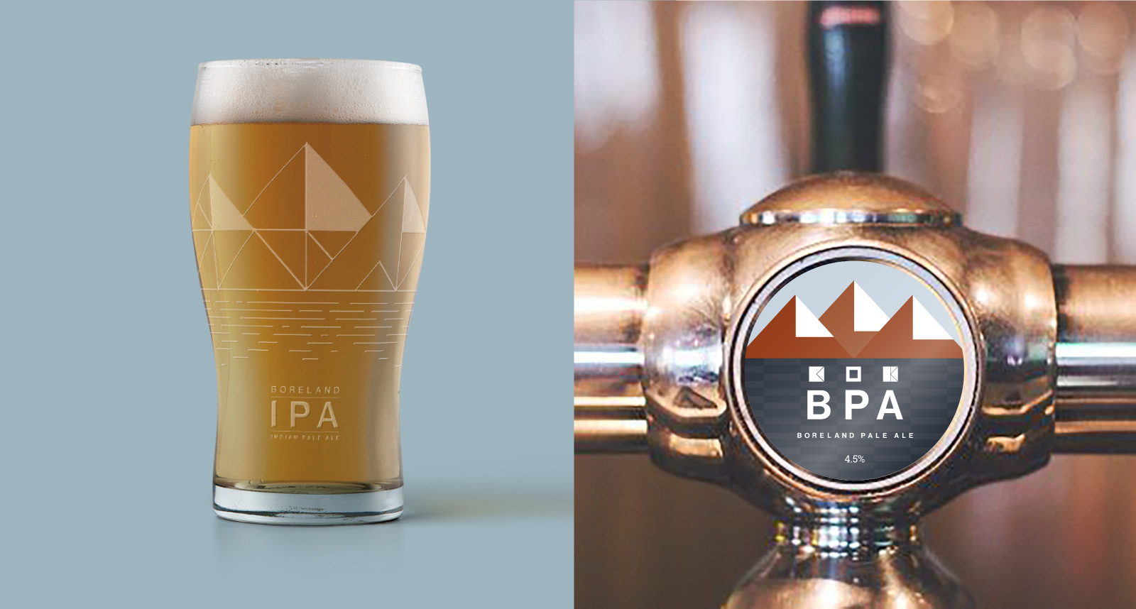
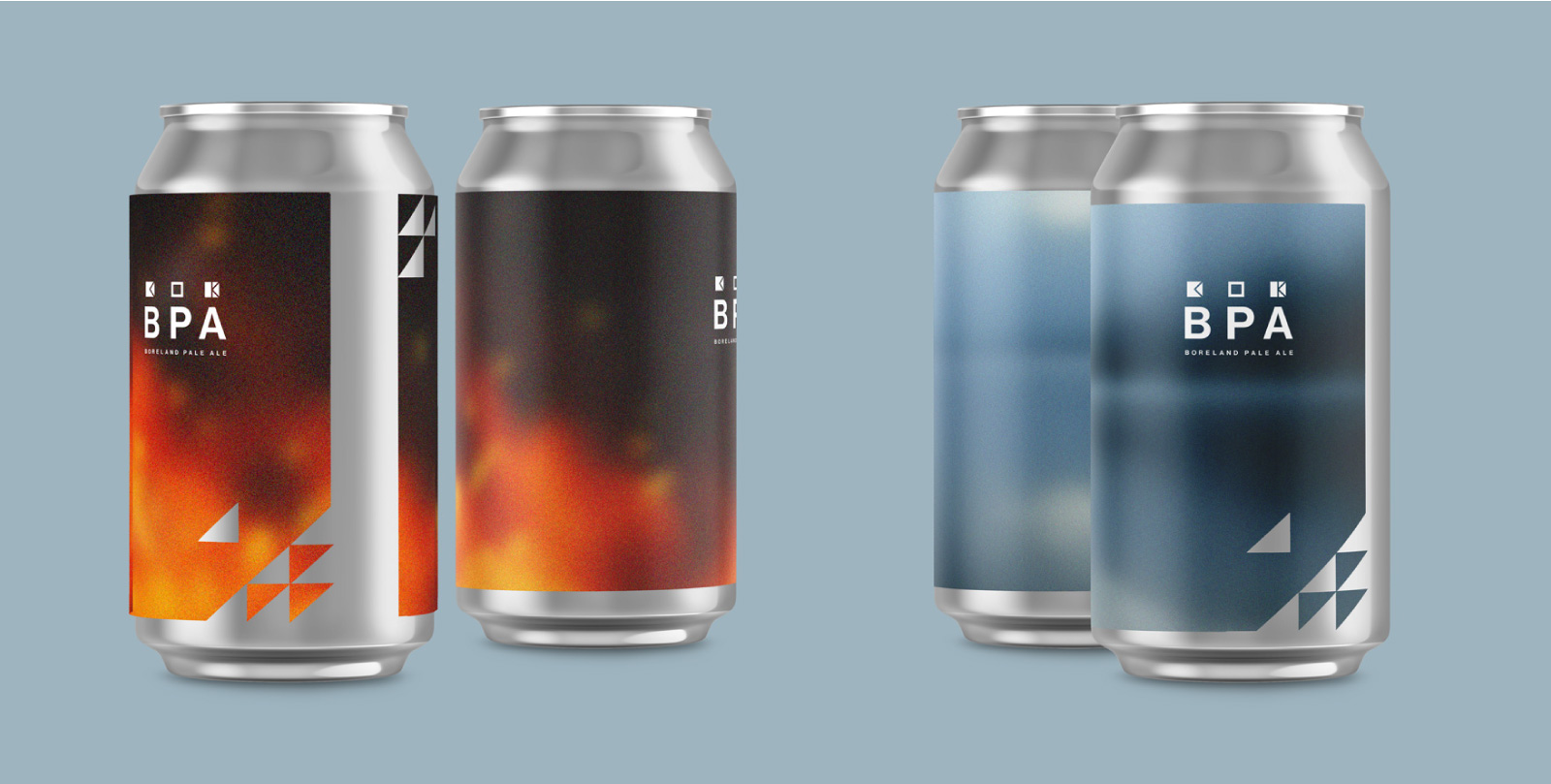
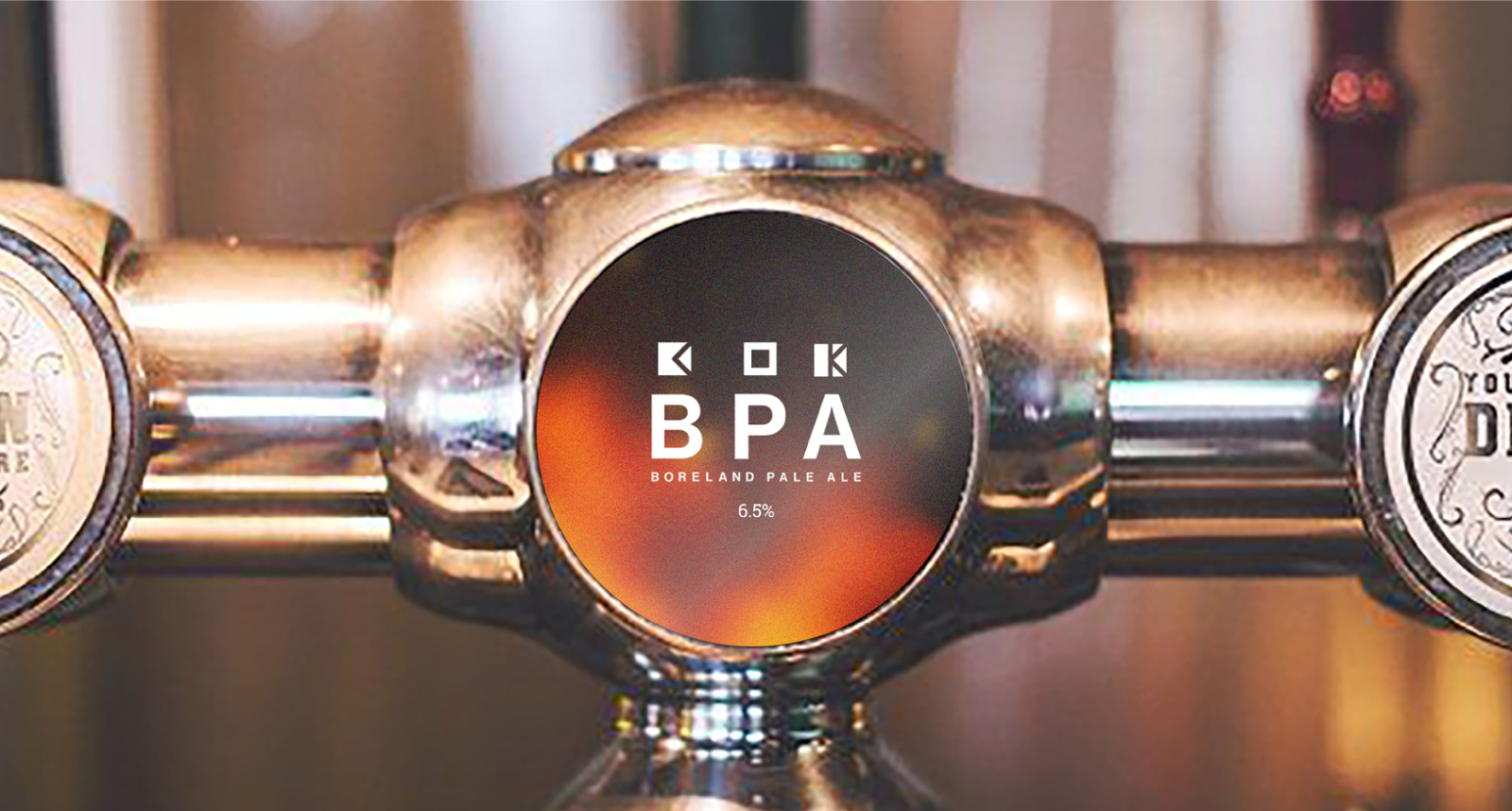
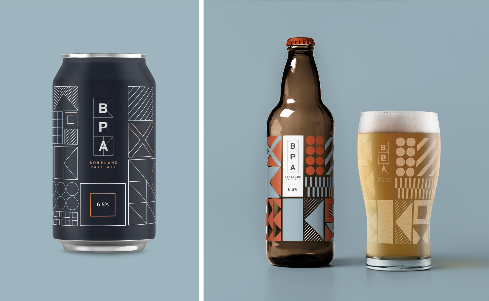
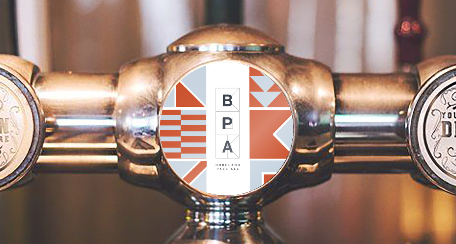
Boreland teamed up with a local brewery to create an IPA to sell at their own bar. I created these packaging designs as part of a 2 day design brief, utilising the geometric shapes of their brand guidelines.
The first design represents the three large mountains in the area on the edge of the loch. The second represents the lock and the fire pits. Designs 3 and 4 represent the shapes of the flags found within the brand.