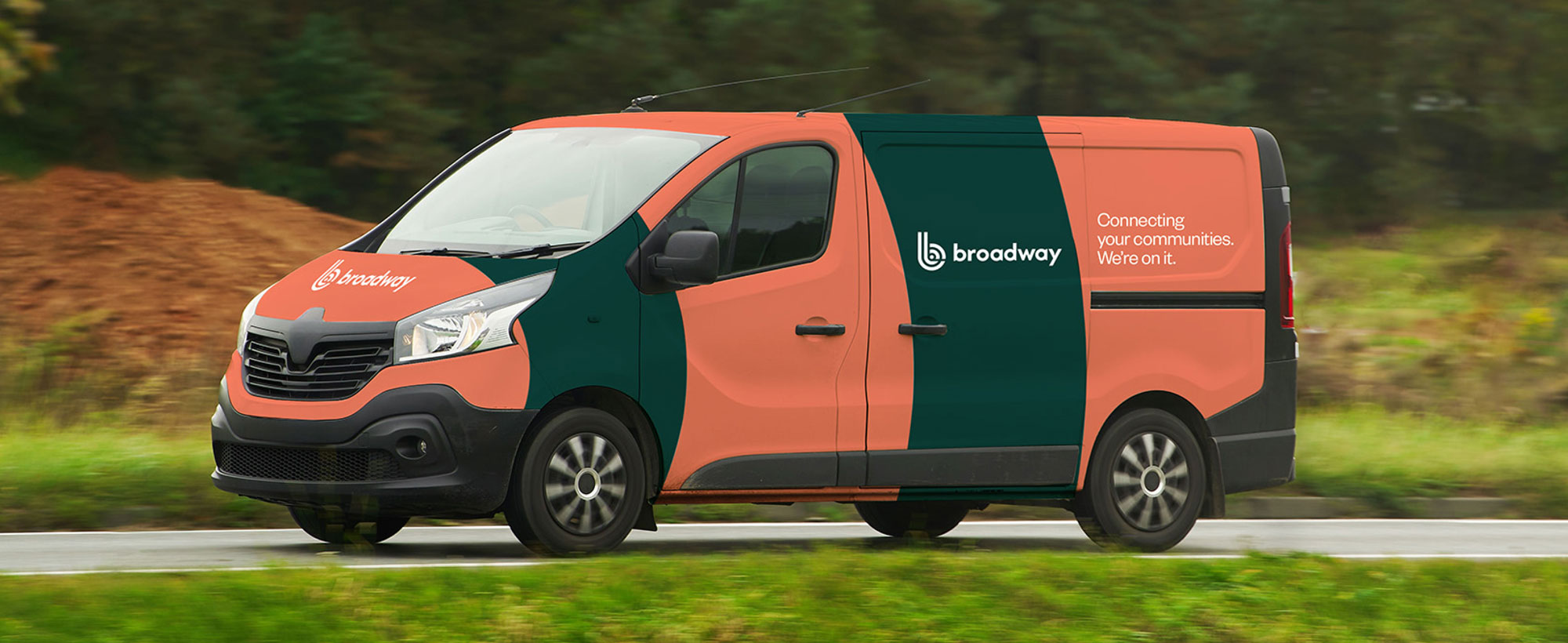
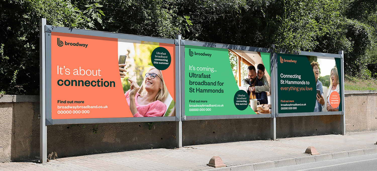
Broadway Broadband are a startup company that bring high-speed broadband to rural communities that don’t have access to the larger networks.
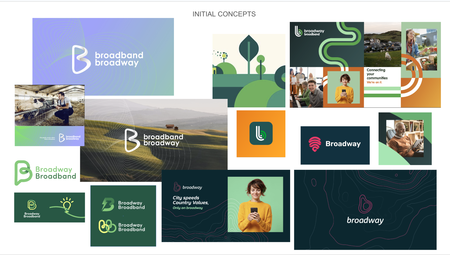
The double B logo marque represents the two Bs of the company name and also incorporates the Wi-Fi mark.
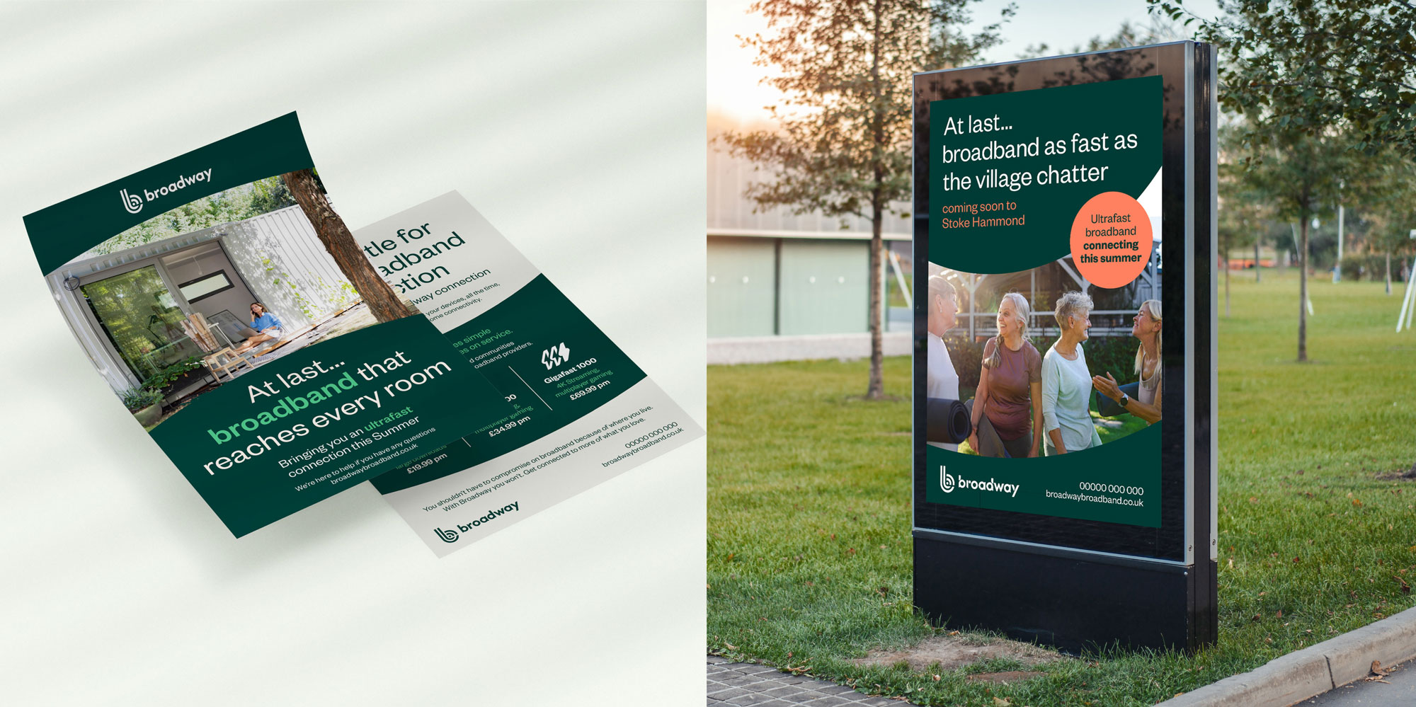
By sizing up the logo marque we used its curves as a design tool within layouts to crop imagery and house our type. The bandwidth designs help people to mentally associate with Wi-Fi connection.
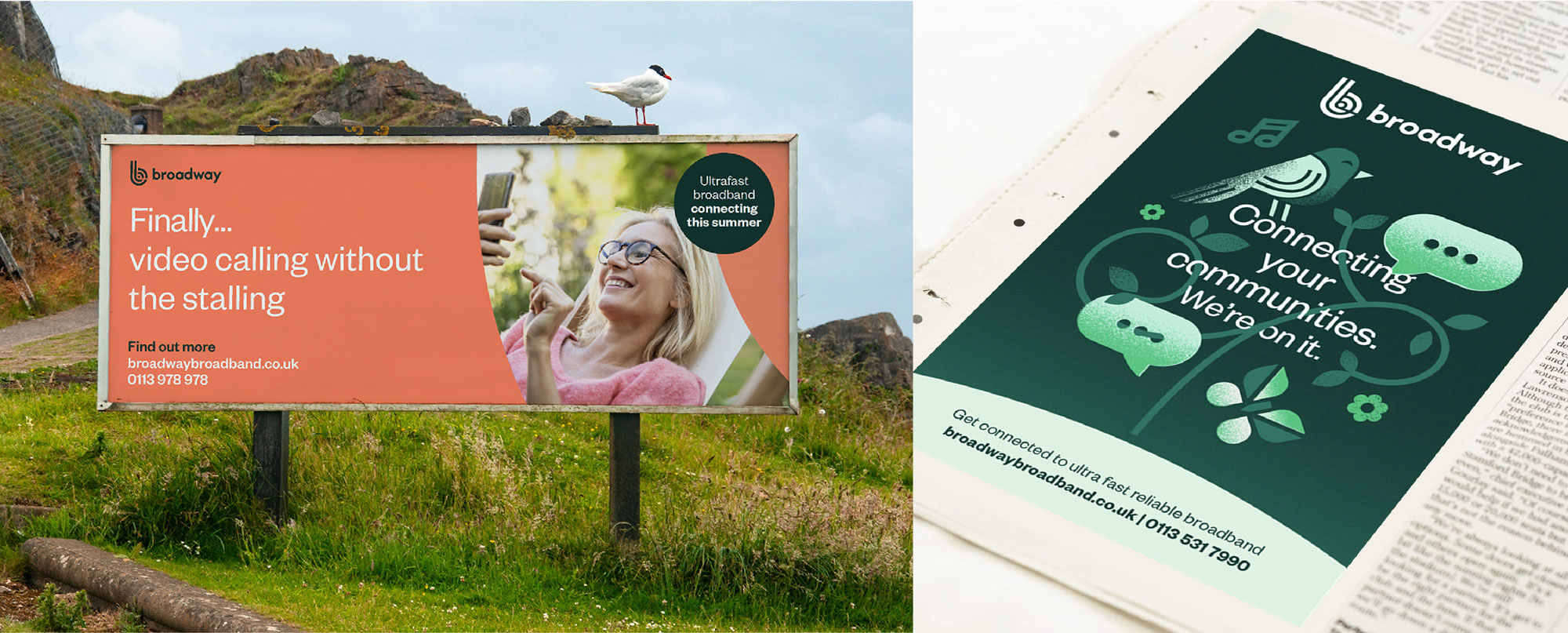
The colour palette is inspired by nature. Photography shows people connecting either socially or through tech within rural settings, this helps to support the brands connecting communities narrative, it feels warm and inviting and tonally includes natures greens where possible.
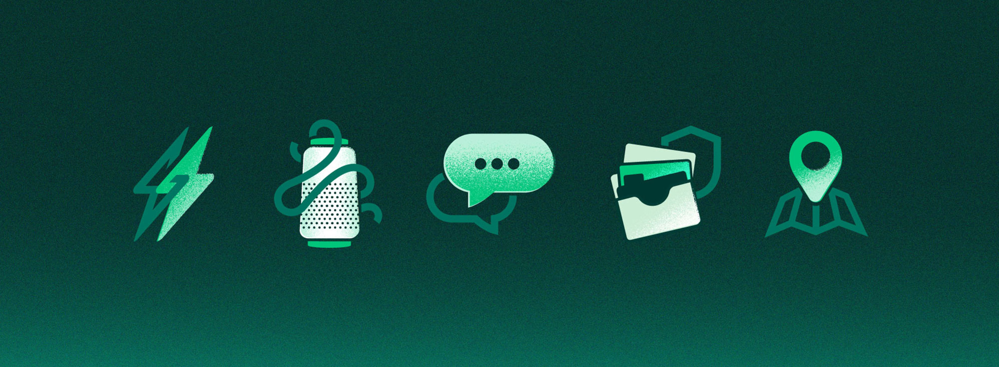
The icon suite reflects the brand marque by mirroring its cutout negative spaces and stroke widths.
The illustration’s take on the icon style’s cutout approach, but adding some texture created a softer, more approachable style adding more flexibility to the brands toolkit.
ClientBroadband BroadwayWhilst atIMAServicesBranding and Print Design