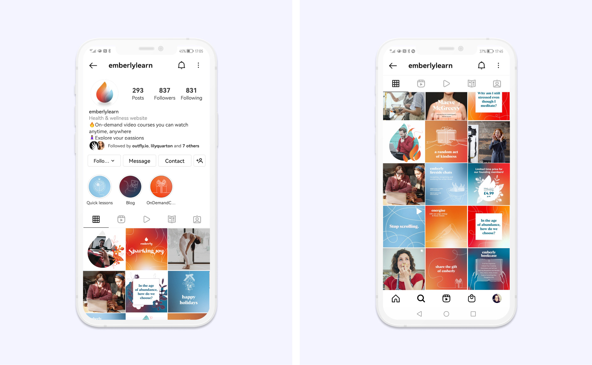
At Outfly agency, I created this brand for a new online learning organisation which we named Emberly.
The idea for the company came from a dance teacher who moved her business online during the pandemic. This inspired her to create a platform where experts could add courses and users pay a subscription to access a wide variety of video courses to learn something new.
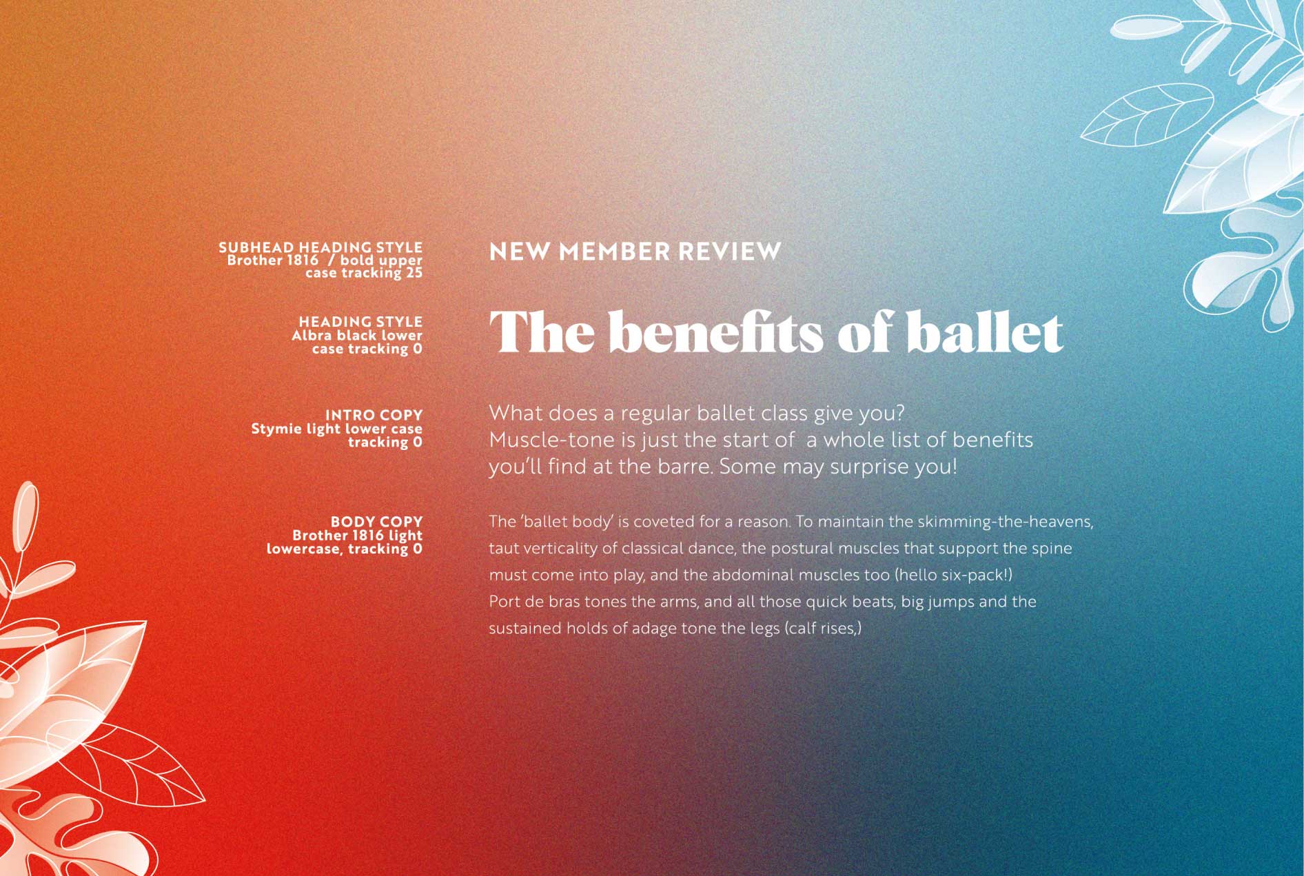
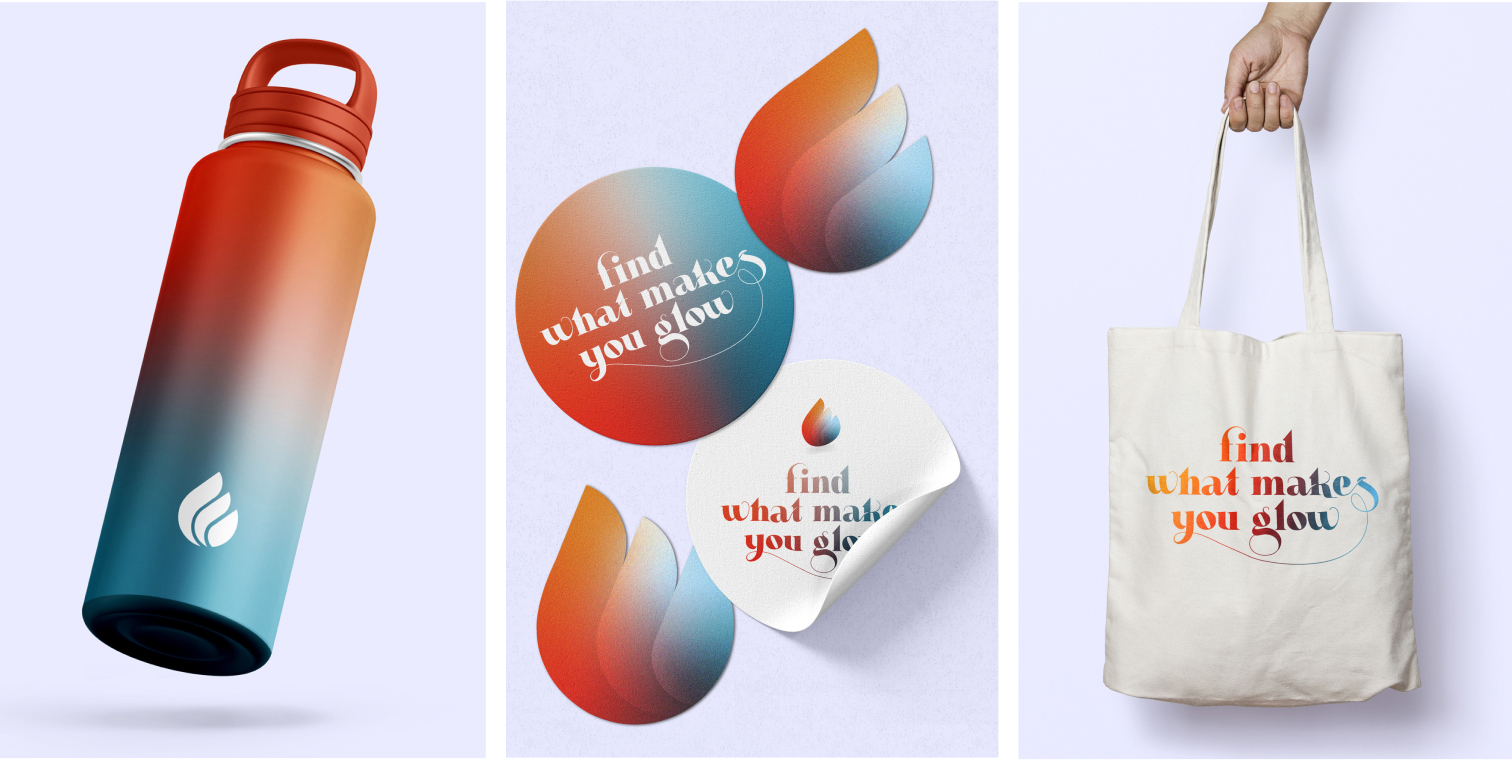
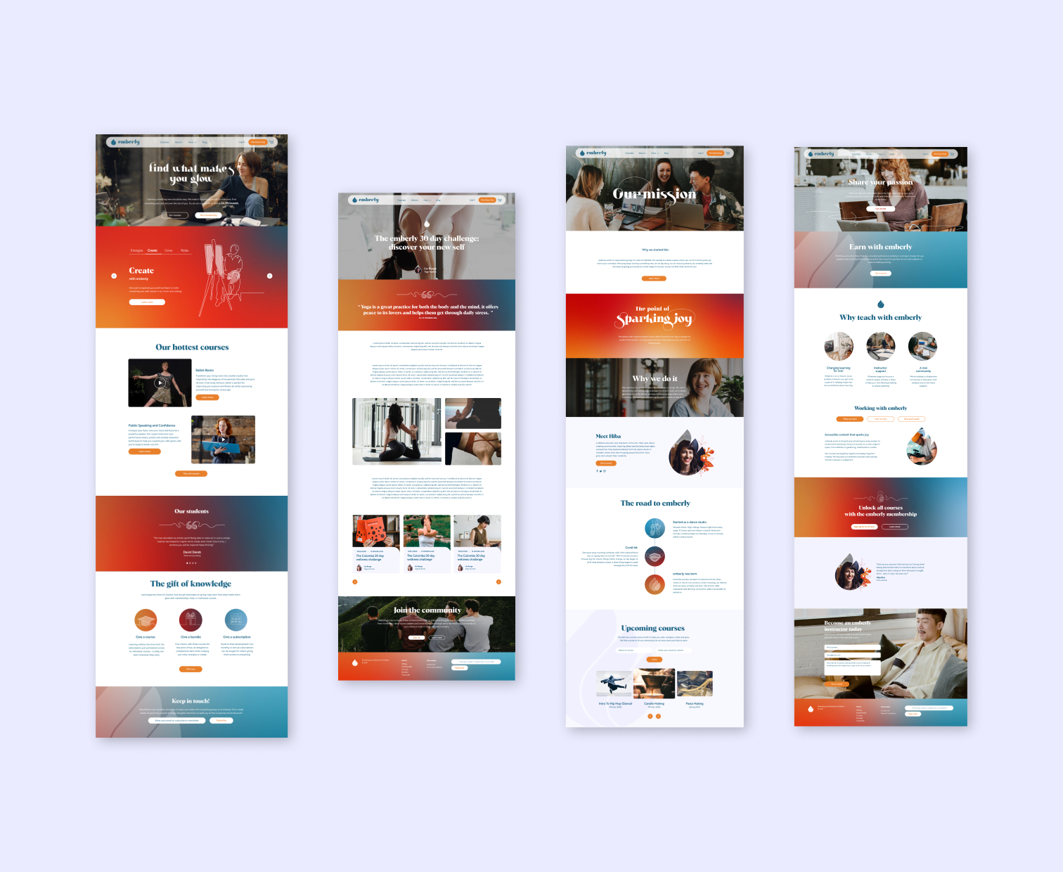
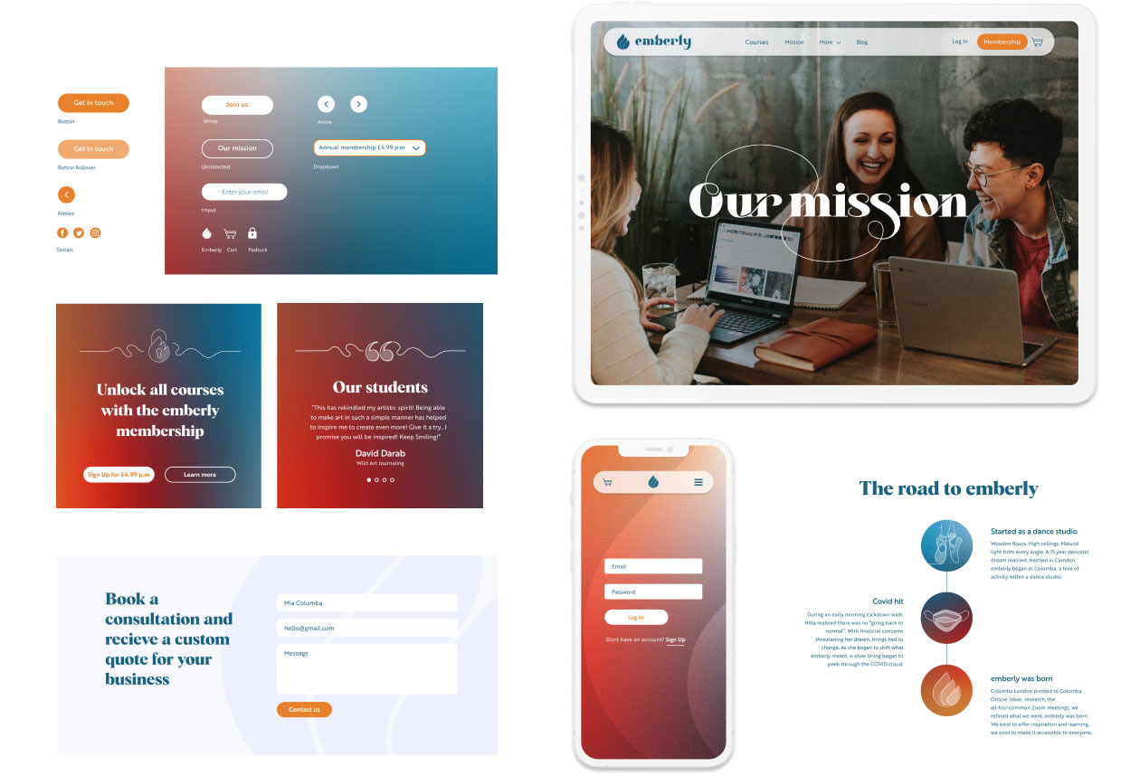
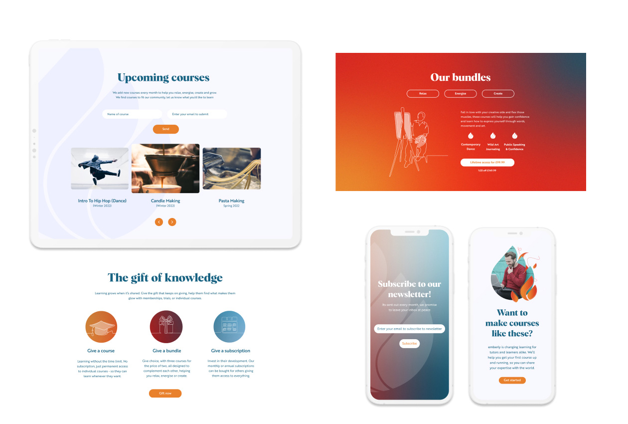
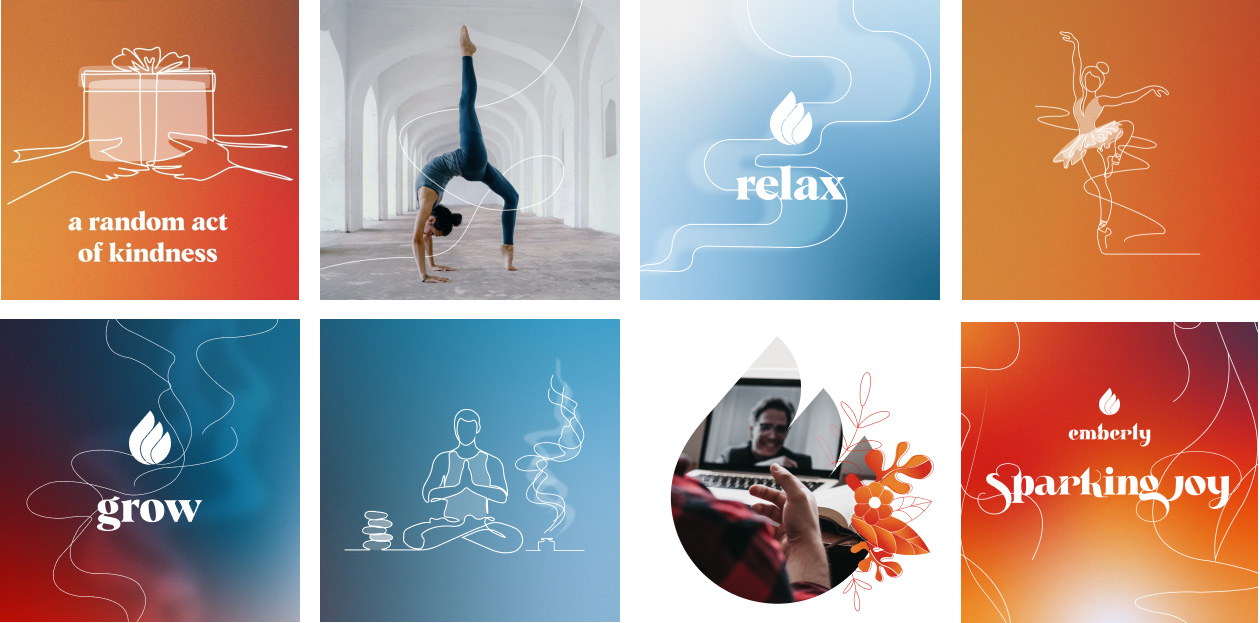
I was involved in the naming process, I rolled out the brand guidelines as well as social content, animations and I also designed the website.
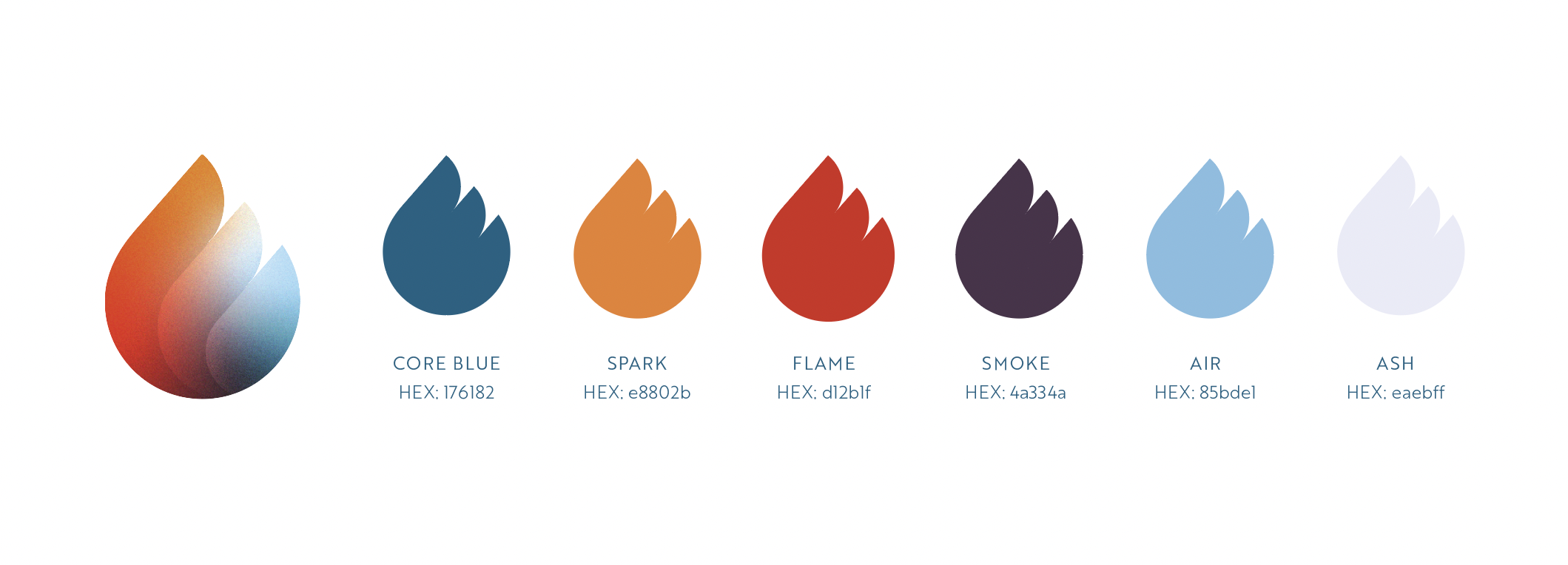
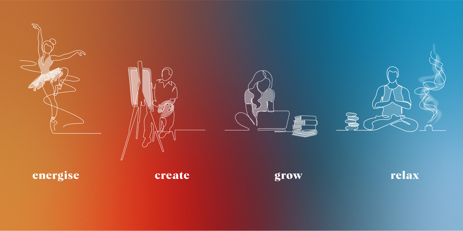
It is named Emberly because learning new things helps you to rekindle your spark and passion for life, like a dying ember reigniting. The logo’s icon represents the flame and the brand’s colour palette reflects the different colours found within fire. The different stages of a fire became a metaphor to help categorise the course content.
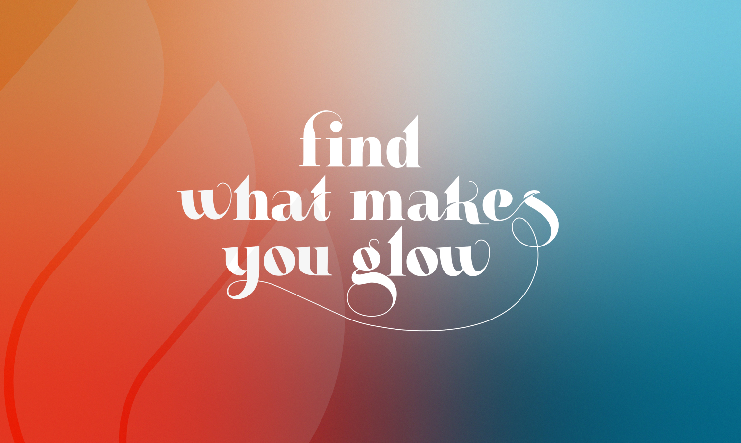
The wispy curling logotype represents the playful lick of a flame and this dancing line continues throughout the rest of the brands illustrations and typography treatments which reflect the fun, joyous nature of the brand.
ClientEmberly Whilst atOutfly LtdServicesBranding project and web design